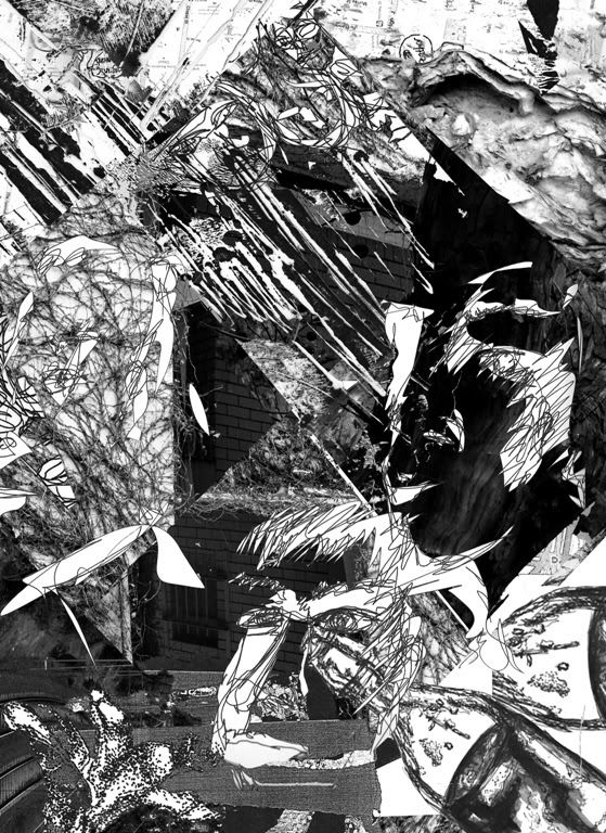
An on-going poster for my 1b project yet to be done (this relates to my previous post about the folding project), I'm not truly confident with the composition and all. Give me inputs tell me what you think how I should improve on this in terms of positioning as well as black and white contrast. I might need to add my haiku in too.. I am so lost.
i love this! It looks like a piece of fine art, i can just imagine like a light opacity haiku written in the middle or at the top. not white, but just light. With a minimal font probably?? or maybe red, the famous graphic colours :red,black and white
ReplyDeletei dunno this is just a suggestion: did some playing and testing, but it seems like it's dominating the really nice drawings and collages though?
http://i1194.photobucket.com/albums/aa370/csab1/te.jpg
http://i1194.photobucket.com/albums/aa370/csab1/test.jpg
NO BROBLEM BEIBZ ;) But that piece is really nice, i can imagine it as a book cover/post card while incorporating some colours like the first example. Do it as a side project if you have time :3
ReplyDeleteYehhh try using that translucent paper! Who knows it'll be better than just a digital white box, since it'll have textures. how long is the haiku??
The font i used is Halvetica. yeh just like print out the font and trace around it haha, you'll have a hand drawn halvetica font!